New year, new AELO (kinda)
If you know me, you know – or quickly realize – that I'm a "that's so cool... but maybe it's not for me" kind of guy and, really, I'm not afraid to let you know I am. That applies most of the time to stylish physical things like clothing, shoes, accessories; you know, things you wear and come to represent how and who you are in some way. I can explain it to you quickly, with the following example:


This is the Acura Integra Type S, my dream car at the moment. The yellow – actually named Tiger Eye Pearl – color is so fucking cool. I love it. It makes the car lines look super crazy and I can bet it looks gorgeous in direct sunlight. However, I think if it came to it I would actually end up buying the white one – it does have exclusive red interiors, though – out of fear that I end up regretting getting the yellow in the long run, because it's too flashy.
Well, the same happens with Acento en la O.
I'm a huge fan of web design. Those crazy designs that catch your eyes. Bold color palette with aggressive contrast. Out of whack shapes for stuff all over your screen. Love it. I would love to have a crazy looking website that breaks some design rules for the sake of "innovation". So, today's the day I looked into making it happen. I decided I would risk it, "what's the worst that could happen?" I thought to myself and started looking into getting my Figma account up and running again, looking for resources and online tools that I could use because I decided to join the Chromebook gang and it comes with limitations itself; I even started thinking about changing the AELO logo because maybe it's time for a reset and it's the part of this blog that's the oldest, its identity – I think it may be even 10 years old, but who knows?
Turns out, I'm limited by Ghost, the platform I use and where I host this blog. I can only use certain themes for my blog and I cannot use custom HTML. If I really wanted I could upgrade to an almost-three-times-more-expensive plan but my plan is already more than what I'd like to pay. So, basically, I'm fucked. Haha. No big redesign. Sorry!
Instead, you get new background and accent colors. Yay! I changed from the default white background to a shade of gray that's more comfortable for those of us who like dark themes but it isn't completely black because I know not everyone likes that. I think this shade is a good middle ground. I also changed the accent color to a stronger shade of yellow / orange because the past tone was not compliant to accessibility rules of contrast when matching it with white. To know for sure that I'm in compliance, I used this super cool tool by JXNBLK called Colorable. I will also be using it to get more crazy ideas when inspiration for a redesign comes again.
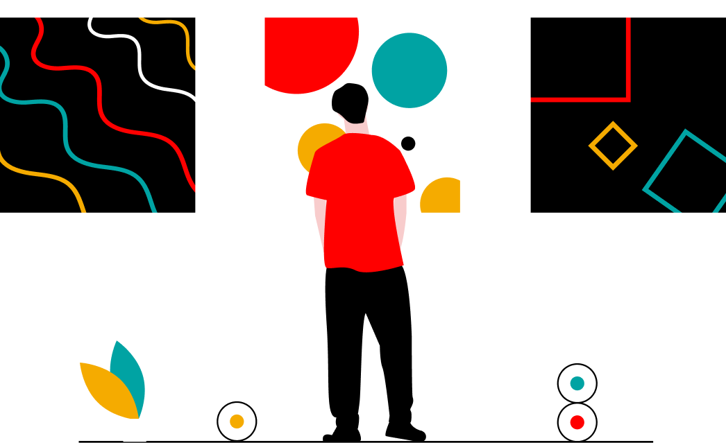
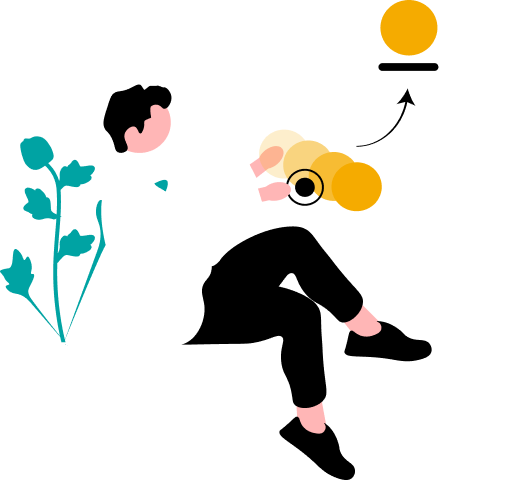
One more thing I want to try and stick to is the usage of branding on images. For that I will be using unDraw, which is a website created by Katerina Limpitsouni that provides open source illustrations in SVG format.
Well, that's all. Hopefully you like the new colors and tools. If you end up using them, please give Jackson and Katerina a follow on their socials, they're both amazing designers.
Have a good one.